
The Psychology of Color in Wellness Branding and Design
January 27, 2024
")
In the kaleidoscope of health and wellness, where every shade promises vitality and vigor, your brand can stand as a beacon of health, hope and well-being.
Your brand is not just a name, a logo, or a product; it’s a promise, an invitation, and a path to a healthier, happier life.
But, the art of wellness branding is more than just words and colors —it’s about tapping into human emotions and our hardwired reasons for motivation and making change.
In this blog, we’ll break down the power of color, and share with you the fascinating psychological responses to colors, and how using the right (or wrong) colors can impact your wellness brand.
The Core Psychology of Color: 5 Key Takeaways for Wellness Branding
The psychology of color is a critical, universal language in wellness branding, allowing brands to convey their values and evoke specific emotional responses at first glance. By selecting the right hues, wellness companies can inspire trust, promote calmness, and encourage positive action without using a single word. For example:
- Blue: Conveys calmness, trust, and serenity (ideal for meditation, skincare, or earned medical trust).
- Green: Signifies health, nature, growth, and renewal (best for organic or health foods, fitness, and eco-friendly brands).
- Yellow: Evokes happiness, optimism, and warmth (used to boost mental health or mood-enhancing and or energizing products).
- Purple: Represents healing, spirituality, and holistic balance (common in yoga or alternative medicine).
- Earth Tones: Provides grounding and a clear connection to natural and eco-friendly, holistic values.
Color and Wellness: A Perfect Match
Before we explore the specific psychological impacts of color, it’s important to understand the strong connection between color and reaction and perception.
For hundreds of years, scholars have theorized and researched color and psychological functioning. In their studies, they found that certain wavelengths of colors are able to “produce systematic physiological reactions that manifest in emotional experience.”
These findings underscore the importance of selecting the right colors for your brand.
Selecting the right colors requires a true understanding of your target audience’s psychological triggers. This is why a comprehensive Branding Diagnostic is crucial. Radiant Marketing analyzes these emotional responses to ensure your palette doesn’t just look good, but actively inspires engagement.
Wellness brands aim to improve lives, promote health, and inspire well-being. Color is a universal language that can convey these values without words. When used effectively in content and marketing materials, colors can:
- Evoke Emotions: Certain colors have the power to evoke emotions that align with wellness, such as calmness, positivity, and energy.
- Communicate Values: Colors can communicate your brand’s values and ethos to your audience. Whether it’s organic, eco-friendly, or vibrant and energetic, color plays a crucial role in showcasing your brand identity.
- Enhance User Perceptions & Experience: The choice of colors in your marketing materials and design can greatly influence how your audience perceives and interacts with your brand. This can impact factors like user engagement and retention.
Now, let’s explore the psychology of colors commonly used in wellness branding.
1. Calming Blue
Blue is often associated with calmness and tranquility. It’s a popular choice for wellness brands that aim to instill a sense of trust, peace and relaxation.
![]()
WHO logo from https://www.who.int/

Calm logo from www.calm.com
Whether you’re offering meditation classes or skincare products, incorporating various shades of blue can help convey a sense of trust and serenity.
2. Energizing Green
Green is a versatile color often linked to health and nature.
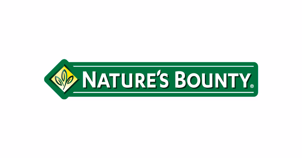 Nature’s Bounty Products from https://naturesbounty.com/collections/supplements
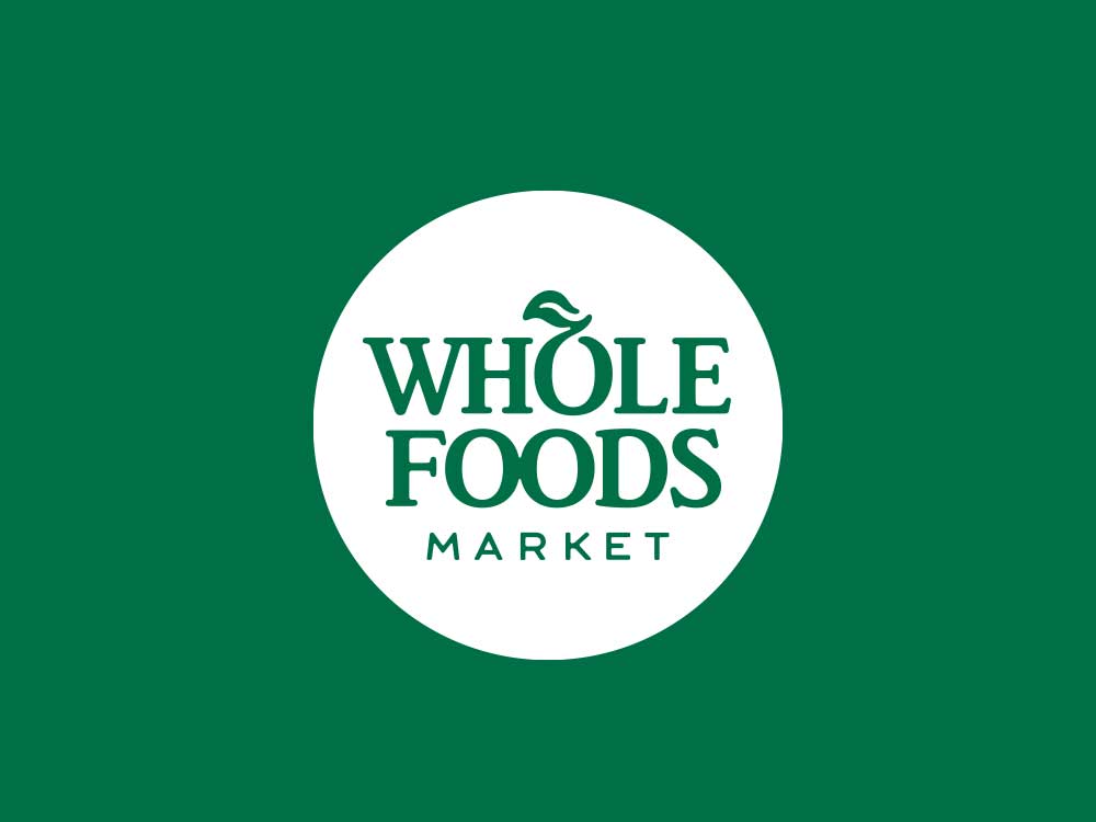
Whole Foods logo from https://www.wholefoodsmarket.com/
Green can signify growth, renewal, and energy, making it an ideal choice for indoor/outdoor fitness centers, health foods/organic products, eco-friendly wellness brands.
3. Uplifting Yellow
Yellow is the color of happiness, optimism, and warmth.

Behance.net image of Nike Livestrong rebrand
For wellness brands focused on boosting mental health or offering mood-enhancing products and services, a touch of yellow can be a powerful visual cue to lift spirits and bring positivity.
4. Healing Purple
Purple is associated with healing and spirituality.
![]()
Prilosec logo from prilosecotc.com
![]()
Alzheimer’s Association logo from alz.org
Wellness brands that focus on holistic healing, yoga, or alternative medicine often incorporate shades of purple to connect with their audience’s desire for balance and well-rounded well-being.
5. Grounding Earth Tones
Earthy colors like brown, blue and earthy greens provide a sense of grounding and connection to nature.
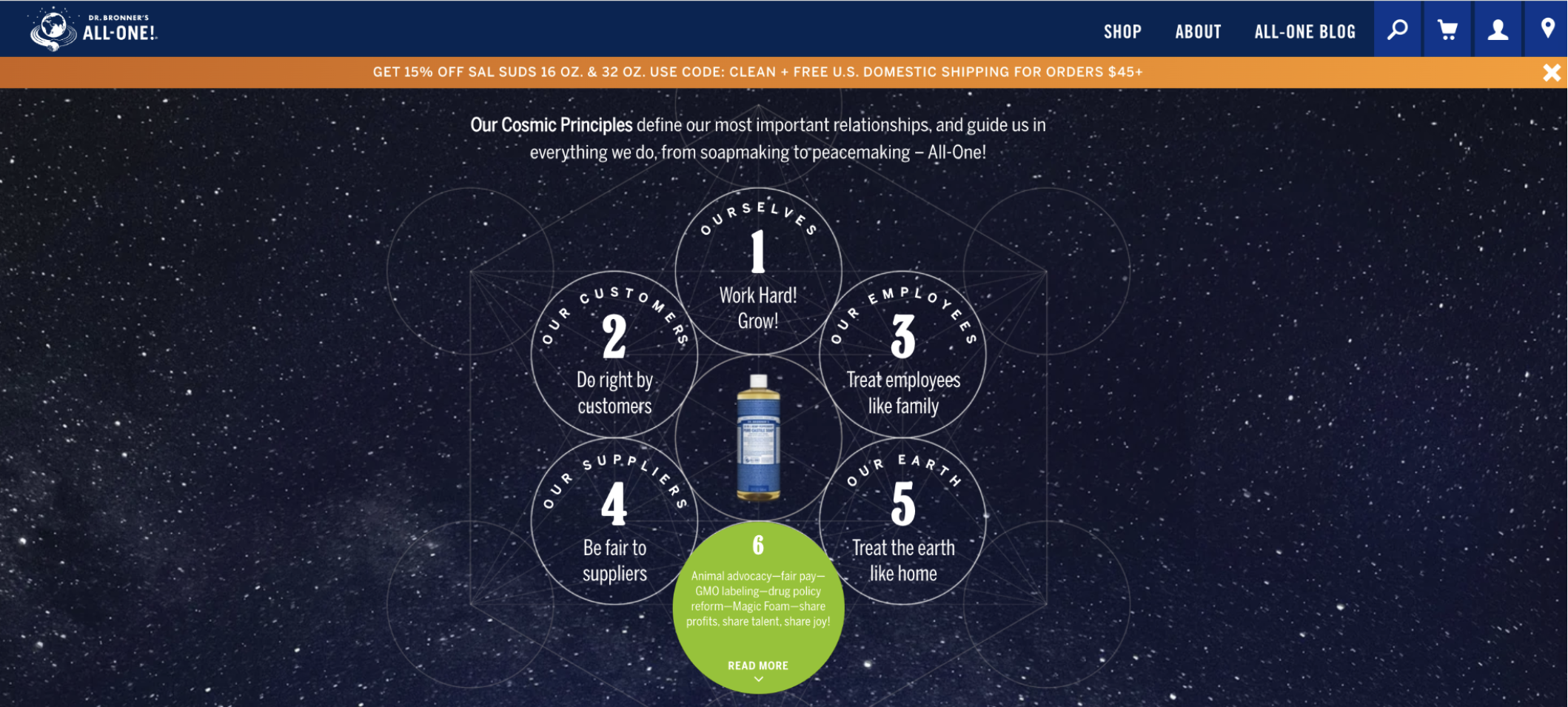
Dr. Bronner’s eco-friendly, earth-toned brand https://www.drbronner.com/

Burt’s Bees web screenshot from https://www.burtsbees.com/
These colors are often used in wellness brands that prioritize holistic well-being and eco-friendliness.
6. Pure White
White symbolizes purity and cleanliness.
![]()
Alo Yoga logo from https://www.aloyoga.com/
Wellness brands that promote purity, simplicity, and balance often use white to create a sense of clarity and transparency.
Mixing Colors for Optimal Results
Much like holistic wellness is a combination of factors (including mental, spiritual and physical health) the practice of mixing colors plays a crucial role in health marketing. Mixing colors strategically can amplify the impact of your brand.
Many brands accidentally choose conflicting hues that actually hurt their message and bottom line. To ensure your final brand palette is balanced and powerfully aligned with your mission and values, consider leveraging our Signature Branding Programs. We specialize in translating complex color psychology into a cohesive, memorable visual brand identity.
By understanding color theory, you can create a balanced palette that evokes the right emotions. Some combinations may include:
- Contrasting colors can create eye-catching combinations
- Analogous colors offer a more harmonious and soothing effect
For instance, combining calming blues and grounding earth tones can convey both trust and a connection to nature.
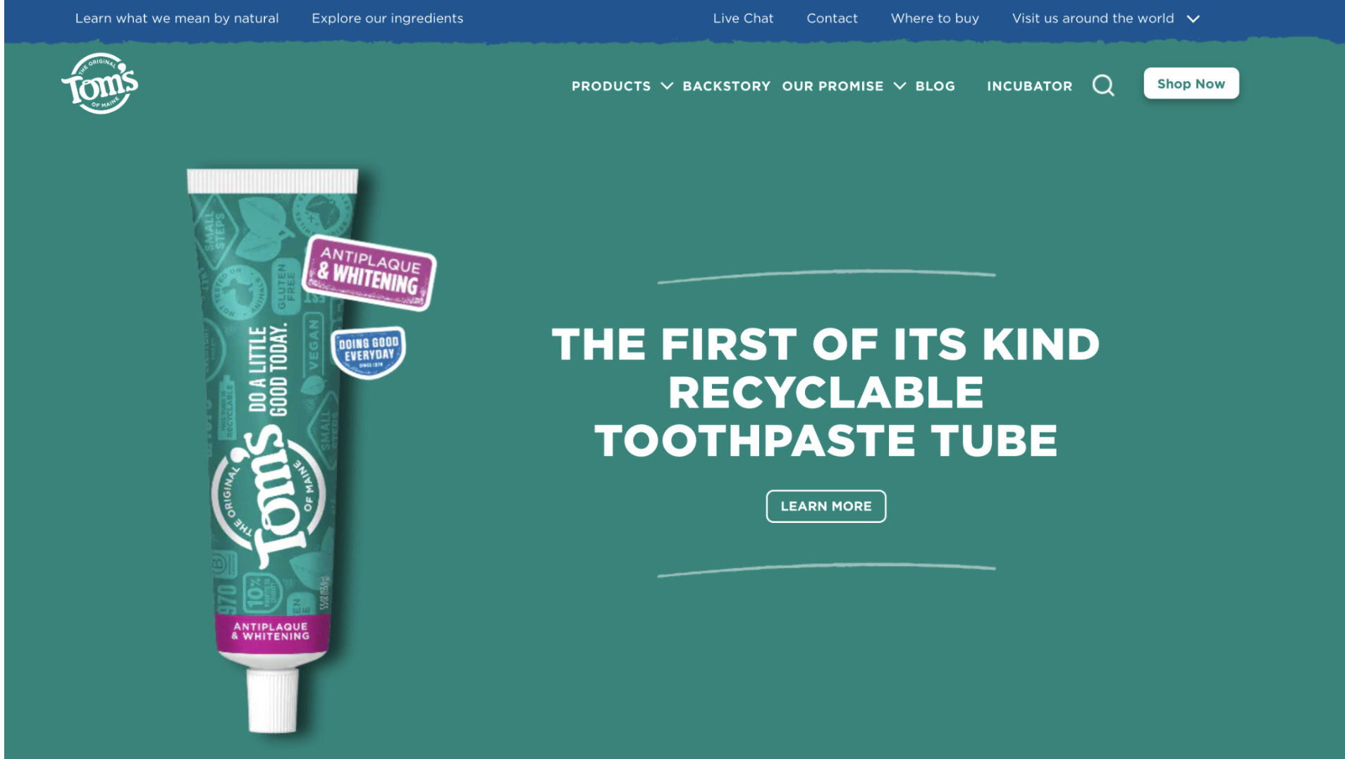
Screenshot from https://www.tomsofmaine.com/
Being Thoughtful When Choosing a Hue or Shade
The hue of a specific color also plays a role in the effect on our emotions so it’s important to be thoughtful with the shade in which you choose.
“Color has three basic properties: hue, lightness, and chroma. Variation in any or all of these properties could influence downstream affect, cognition, or behavior.” –Fairchild M. D. (2015). Seeing, adapting to, and reproducing the appearance of nature. Appl. Optics
This means the hue of a color you choose, has just as much of an influence as the color itself. For example, an energizing, bright green hue evokes feelings of renewal, growth, and energy, while an earth-tone green can bring a calmer sense of grounding.

Vibrant Hues for a Radiant You
In the wellness industry, leveraging the psychology of color is a powerful tool that can influence your audience’s perception and emotional connection with your brand.
When crafting your wellness brand’s identity, keep in mind the emotions and values you wish to convey and consider how the psychology of color can be harnessed to make your brand resonate with your audience.
By thoughtfully choosing the right colors, you can create a brand that not only looks good but also inspires trust, connection, and well-being.
Let Radiant Marketing help you harness the power of color to create a brand that truly shines in the wellness industry. Our Branding Diagnostic Program and Signature Branding Programs help you identify the emotional response of your customers, how to best appeal to them – through words, colors and imagery – to inspire engagement, and create an awe-inspiring brand.
References:
Goethe W. (1810). Theory of Colors. London: Frank Cass.
Join the Radiant list!
Get expert insights, fresh ideas, and our founder’s VIP
notes on brand growth sent straight to your inbox.